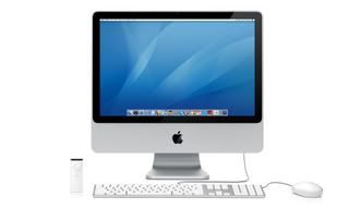
5am edit: After looking at more videos and pictures I'm slowly starting to like the new iMacs. There is still something about them that upsets me esthetically. Apple knows how to write software, they know how to build computers and more importantly they know how to make it all look good. Did you know the dimensions of the iPod are pretty damn close to the golden ratio? Yet with this newest incarnation of their consumer flagship computer the iMac, they seemed to have fumbled if only slightly. Tomorrow I will go and check one out in person, but from all the pictures Ive seen I'm going to say I can make an educated assessment of the iMac, from a visual stand point.
Visually the brushed aluminum of the past Powerbooks (i own one and its pretty), Macbook Pros, Cinema displays, Mac Mini and Mac Pros is very appealing to the eye. It gives a clean, upscale not plasticy and therefore cheap look. And it holds up to scratches... dents are another thing. Regardless Apple hit it big with wrapping their computers in good old AI [aluminum]. And they almost got it right again with the new iMacs. But what in gods name were they thinking with that black border around the monitor? Ive heard people saying it gives a little bit of "pop" to the screen, which I can understand. With the Mac Mini the mixture of white plastic and aluminum seemed to have worked. The white didn't contrast with the gray of the aluminum as the black does so strikingly with the new iMacs. Or maybe it's just the ratio of aluminum to black plastic that makes it slightly less appealing. The behind of the new iMac is prettier than its facade. With a larger ratio of black to the silver lining of aluminum around the border, a bold clean look is presented in the back. I feel if Apple would just pull down the black to cover the silver chin of the iMac it would look more 10x more appealing. We will just have to see how consumers approach this glass and aluminum generation of iMacs.


No comments:
Post a Comment